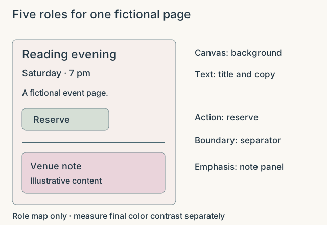
Assign jobs before choosing shades
A website needs color for different purposes: a reading surface, text, boundaries, interactive controls and occasional emphasis. Treating every attractive shade as interchangeable can make those roles unclear. Begin by describing the job each color must do. A pale decorative area may be suitable for a large illustration but unsuitable for small text. A strong accent may work for one primary action while becoming distracting across an entire article. The palette should support the hierarchy of the page, not compete with every part of it.